Ska Analysis Tutorial
Overview
This document gives a tutorial introduction to analysis using the Ska analysis environment, including basic configuration and a number of examples.
The Ska analysis environment consists of a full-featured Python installation with interactive analysis, plotting and numeric capability along with the Ska engineering telemetry archive.
The telemetry archive consists of:
Tools to ingest and compress telemetry from the CXC Chandra archive products.
Compressed telemetry files in HDF5 format. Each MSID has three associated products:
Full time-resolution data: time, value, quality
5-minute statistics: min, max, mean, sampled value, number of samples
Daily statistics: min, max, mean, sampled value, standard deviation, percentiles (1, 5, 16, 50, 84, 95, 99), number of samples.
Configure
To set up for using the Ska3 environment, visit the Ska3 configuration hints page.
Basic Functionality Test
Once you have done the configuration setup that was just described, open a new
xterm window and get into the Ska3 environment by use the ska3 alias:
% ska3
To test the basic functionality of your setup, try the following at the linux shell prompt. In this tutorial all shell commands are shown with a “% ” to indicate the shell prompt. Your prompt may be different and you should not include the “% “ when copying the examples.:
% ipython --matplotlib
You should see something that looks like:
Python 3.8.3 (default, Jul  2 2020, 11:26:31)
Type 'copyright', 'credits' or 'license' for more information
IPython 7.16.1 -- An enhanced Interactive Python. Type '?' for help.

In [1]:
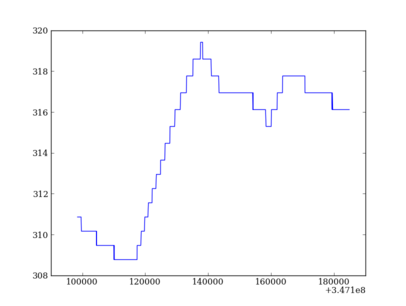
Now read some data and make a simple plot by copying the following lines in ipython:
import cheta.fetch as fetch
import matplotlib.pyplot as plt
tephin = fetch.MSID('tephin', '2009:001', '2009:002')
plt.plot(tephin.times, tephin.vals)
You should get a figure like:
Tools overview
There are four key elements that are the basis for doing plotting and analysis with the engineering archive.
cheta.fetch: module to read and manipulate telemetry data
IPython: interactive python interpreter
matplotlib: python plotting package with an interface similar to Matlab
NumPy: python numerical package for fast vector and array math
cheta.fetch
The tools to access and manipulate telemetry with the Ska engineering archive are described in the Fetch Tutorial.
IPython
IPython is a command-line tool that provides a python prompt that is the basis for interactive analysis. At the core it provides an interpreter for python language commands but with the addition of external packages like matplotlib and numpy it becomes a full-featured data analysis environment. IPython is similar in many ways to the command-line interface in Matlab or IDL.
See the IPython documentation page.
For interactive data analysis IPython has a special --matplotlib command line
option which enables interactive plotting from the command line:
% ipython --matplotlib

import matplotlib.pyplot as plt
import numpy as np

x = np.arange(0, 10, 0.2)
y = np.sin(x)
print(x)
plt.plot(x, y)
Keyboard navigation and history
One of the most useful features of IPython is the ability to edit and navigate you command line history. This lets you quickly re-do commands, perhaps with a slight variation based on seeing the last result. Try cut-n-pasting the above lines in an IPython session. This should bring up a plot of a sine wave.
Now hit up-arrow once and get back the plt.plot(x, y) line. Hit the left-arrow
key (not backspace) once and type **2 so that the line reads plt.plot(x,
y**2). Now you can hit Return to see the new curve overlayed within the same
plot window. It is not necessary to forward-space to the end of the line, you
can hit Return with the cursor anywhere in the line.
Now say you want to change the x values slightly. One option is to just hit the
up-arrow 5 times, but a much faster way is to remember that the line started
with x, so type x and then start hitting up-arrow. Only lines that
start with x will be displayed and you are immediately at the
x = np.arange(0, 10, 0.2) line. Now use the right-arrow and backspace to change 10 to
15 and hit Return. Of course y needs to be recalculated, so hit y
then up-arrow, then Return. Finally pl up-arrow and Return. Nice and fast!
Bonus points: to speed up by another factor of several, use Ctrl-p (prev) instead of up-arrow, Ctrl-n (next) instead of down-arrow, Ctrl-f (forward) instead of right-arrow and Ctrl-b (back) instead of left-arrow. That way your fingers never leave the keyboard home keys. Ctrl-a gets you to the beginning of the line and Ctrl-e gets you to the end of the line. Triple bonus: on a Mac or Windows machine re-map the Caps-lock key to be Control so it’s right next to your left pinky. How often do you need Caps-lock?
Your command history is saved between sessions (assuming that you exit IPython
gracefully) so that when you start a new IPython you can use up-arrow to re-do
old commands. You can view your history within the current session by entering
history.
Linux and shell commands
A select set of useful linux commands are available from the IPython prompt.
These include ls (list directory), pwd (print working directory),
cd (change directory), and rm (remove file). Any shell command
can be executed by preceding it with an exclamation point “!”.
Tab completion
IPython has a very useful tab completion feature that can be used both to complete file names and to inspect Python objects. As a first example do:
ls /proj/sot/ska/<TAB>
This will list everything that matches /proj/sot/ska. You can continue
this way searching through files or hit Return to complete the command.
Tab completion also works to inspect object attributes. Every variable or constant in python is actually a object with a type and associated attributes and methods. For instance try to create a list of 3 numbers:
a = [3, 1, 2, 4]
print(a)
a.<TAB>
This will show the available methods for a:
In [17]: a.<TAB>
a.append   a.extend   a.insert   a.remove   a.sort
a.count    a.index    a.pop      a.reverse
Here you see useful looking functions like append or sort which you can
get help for and use:
help a.sort
a.sort()
print(a)
For a more concrete example, say you want to fetch some daily telemetry values but forgot exactly how to do the query and what are the available columns. Use help and TAB completion to remind yourself:
import cheta.fetch as fetch
help fetch
tephin = fetch.MSID('tephin', '2009:001', '2009:002', stat='daily')
tephin.<TAB>
 tephin.bads               tephin.midvals            tephin.samples
 tephin.colnames           tephin.mins               tephin.stat
 tephin.content            tephin.msid               tephin.state_codes
 tephin.datestart          tephin.MSID               tephin.state_intervals
 tephin.datestop           tephin.p01s               tephin.stds
 tephin.dt                 tephin.p05s               tephin.tdb
 tephin.filter_bad         tephin.p16s               tephin.times
 tephin.filter_bad_times   tephin.p50s               tephin.tstart
 tephin.indexes            tephin.p84s               tephin.tstop
 tephin.iplot              tephin.p95s               tephin.unit
 tephin.logical_intervals  tephin.p99s               tephin.vals
 tephin.maxes              tephin.plot               tephin.write_zip
 tephin.means              tephin.raw_vals
OK, now you remember you wanted times and maxes. But look, there are
other tidbits there for free that look interesting. So go ahead and print a few:
print(tephin.colnames)
print(tephin.dt)
print(tephin.MSID)
To make it even easier you don’t usually have to use print. Try the
following:
tephin.colnames
tephin.dt
tephin.MSID
Don’t be scared to try printing an array value (e.g. tephin.vals) even if
it is a billion elements long. Numpy will only print an abbreviated version if
it is too long. But beware that this applies to Numpy arrays which as we’ll
see are a special version of generic python lists. If you print a
billion-element python list you’ll be waiting for a while.
NumPy
Even though it was not explicit we have already been using NumPy arrays in the examples so far. NumPy is a Python library for working with multidimensional arrays. The main data type is an array. An array is a set of elements, all of the same type, indexed by a vector of nonnegative integers.
NumPy has an excellent quickstart tutorial available.
Here we just show the very basics. In these examples the python prompt is shown as “>>>” in order to distinguish the input from the outputs.
Arrays can be created in different ways:
>>> import numpy as np
>>> a = np.array( [ 10, 20, 30, 40 ] )   # create an array out of a list
>>> a
array([10, 20, 30, 40])
>>> b = np.arange( 4 )                   # create an array of 4 integers, from 0 to 3
>>> b
array([0, 1, 2, 3])
>>> c = np.linspace(-pi,pi,3)            # create an array of 3 evenly spaced samples from -pi to pi
>>> c
array([-3.14159265,  0.        ,  3.14159265])
New arrays can be obtained by operating with existing arrays:
>>> d = a+b**2                        # elementwise operations
>>> d
array([10, 21, 34, 49])
Arrays may have more than one dimension:
>>> x = np.ones( (3,4) )
>>> x
array([[1., 1., 1., 1.],
       [1., 1., 1., 1.],
       [1., 1., 1., 1.]])
>>> x.shape                            # a tuple with the dimensions
(3, 4)
and you can change the dimensions of existing arrays:
>>> y = np.arange(12)
>>> y
array([ 0,  1,  2,  3,  4,  5,  6,  7,  8,  9, 10, 11])
>>> y.shape = 3,4              # does not modify the total number of elements
>>> y
array([[ 0,  1,  2,  3],
       [ 4,  5,  6,  7],
     [ 8,  9, 10, 11]])
It is possible to operate with arrays of different dimensions as long as they fit well (broadcasting):
>>> 3*a                                # multiply each element of a by 3
array([ 30,  60,  90, 120])
>>> a+y                                # sum a to each row of y
array([[10, 21, 32, 43],
       [14, 25, 36, 47],
       [18, 29, 40, 51]])
Similar to Python lists, arrays can be indexed, sliced and iterated over:
>>> a[2:4] = -7,-3                     # modify last two elements of a
>>> for i in a:                        # iterate over a
...     print(i)
...
10
20
-7
-3
When indexing more than one dimension, indices are separated by commas:
>>> x[1,2] = 20
>>> x[1,:]                             # x's second row
array([ 1,  1, 20,  1])
>>> x[0] = a                           # change first row of x
>>> x
array([[10, 20, -7, -3],
       [ 1,  1, 20,  1],
       [ 1,  1,  1,  1]])
Matplotlib
The pyplot mode of matplotlib is a collection of command style functions
that make matplotlib work like matlab. Each pyplot function makes
some change to a figure: eg, create a figure, create a plotting area
in a figure, plot some lines in a plotting area, decorate the plot
with labels, etc…. Pyplot is stateful, in that it
keeps track of the current figure and plotting area, and the plotting
functions are directed to the current axes. On the
matplotlib FAQ page there is a
very good discussion on
Matplotlib, pylab, and pyplot: how are they related?.
This tutorial has been copied and adapted from the matplotlib pyplot tutorial.
To see matplotlib in action and make a simple plot do:
import matplotlib.pyplot as plt
plt.clf()
plt.plot([1,2,3])
plt.ylabel('some numbers')
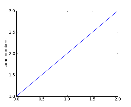
You may be wondering why the x-axis ranges from 0-2 and the y-axis
from 1-3. If you provide a single list or array to the
plot() command, matplotlib assumes it is a
sequence of y values, and automatically generates the x values for
you. Since python ranges start with 0, the default x vector has the
same length as y but starts with 0. Hence the x data are
[0,1,2].
plot() is a versatile command, and will take an arbitrary number of arguments. For example, to plot x versus y, you can issue the command:
plt.clf()
plt.plot([1,2,3,4], [1,4,9,16])
For every x, y pair of arguments, there is a optional third argument which is the format string that indicates the color and line type of the plot. The letters and symbols of the format string are from matlab, and you concatenate a color string with a line style string. The default format string is ‘b-’, which is a solid blue line. For example, to plot the above with red circles, you would issue:
plt.clf()
plt.plot([1,2,3,4], [1,4,9,16], 'ro')
plt.axis([0, 6, 0, 20])
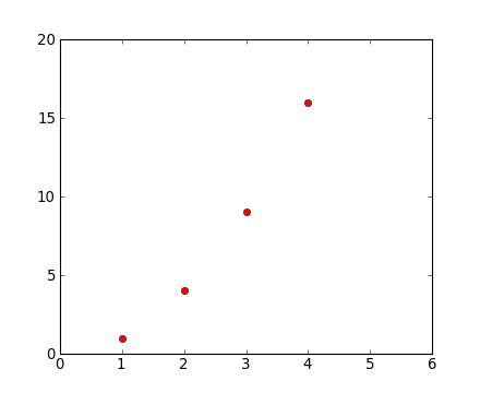
See the plot() documentation for a complete
list of line styles and format strings. The
axis() command in the example above takes a
list of [xmin, xmax, ymin, ymax] and specifies the viewport of the
axes.
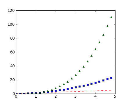
If matplotlib were limited to working with lists, it would be fairly useless for numeric processing. Generally, you will use numpy arrays. In fact, all sequences are converted to numpy arrays internally. The example below illustrates a plotting several lines with different format styles in one command using arrays.
# evenly sampled time at 200ms intervals
t = np.arange(0., 5., 0.2)

# red dashes, blue squares and green triangles
plt.clf()
plt.plot(t, t, 'r--', t, t**2, 'bs', t, t**3, 'g^')
Working with multiple figures and axes
Both Matlab and Pylab have the concept of the current figure and the current axes. All plotting commands apply to the current axes. The function gca() returns the current axes and gcf() returns the current figure. Normally, you don’t have to worry about this, because it is all taken care of behind the scenes. Below is a script to create two subplots.
def f(t):
    return np.exp(-t) * np.cos(2*np.pi*t)

t1 = np.arange(0.0, 5.0, 0.1)
t2 = np.arange(0.0, 5.0, 0.02)

plt.figure(1)
plt.clf()
plt.subplot(2, 1, 1)  # (nrows, ncols, fignum)
plt.plot(t1, f(t1), 'bo', t2, f(t2), 'k')

plt.subplot(2, 1, 2)
plt.plot(t2, cos(2*pi*t2), 'r--')
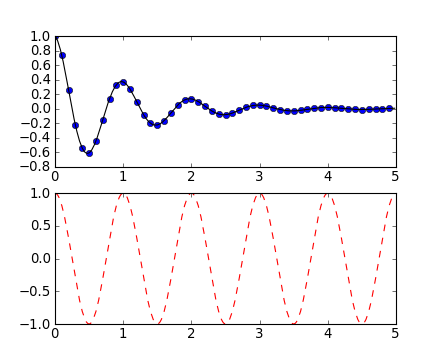
The figure() command here is optional because
figure(1) will be created by default, just as a subplot(1, 1, 1)
will be created by default if you don’t manually specify an axes. The
subplot() command specifies numrows,
numcols, fignum where fignum ranges from 1 to
numrows*numcols. The commas in the subplot command are
optional if numrows*numcols<10. You can create an arbitrary number of subplots
and axes. If you want to place an axes manually, ie, not on a
rectangular grid, use the axes() command,
which allows you to specify the location as axes([left, bottom,
width, height]) where all values are in fractional (0 to 1)
coordinates.
You can create multiple figures by using multiple figure() calls with an increasing figure number. Of course, each figure can contain as many axes and subplots as your heart desires:
plt.figure(1)                # the first figure
plt.clf()
plt.subplot(2, 1, 1)         # the first subplot in the first figure
plt.plot([1,2,3])
plt.subplot(2, 1, 2)         # the second subplot in the first figure
plt.plot([4,5,6])


plt.figure(2)                # a second figure
plt.clf()
plt.plot([4,5,6])            # creates a subplot(111) by default

plt.figure(1)                # figure 1 current; subplot(2, 1, 2) still current
plt.subplot(2, 1, 1)         # make subplot(2, 1, 1) in figure1 current
plt.title('Easy as 1,2,3')   # subplot 2, 1, 1 title
You can clear the current figure with clf() and the current axes with cla(). If you find this statefulness, annoying, don’t despair, this is just a thin stateful wrapper around an object oriented API, which you can use instead (see artist-tutorial)
Working with text
The text() command can be used to add text in an arbitrary location, and the xlabel(), ylabel() and title() are used to add text in the indicated locations (see text-intro for a more detailed example):
mu, sigma = 100, 15
x = mu + sigma * np.random.normal(size=10000)

# the histogram of the data
plt.clf()
n, bins, patches = plt.hist(x, 50, normed=1, facecolor='g', alpha=0.75)

plt.xlabel('Smarts')
plt.ylabel('Probability')
plt.title('Histogram of IQ')
plt.text(60, .025, r'$\mu=100,\ \sigma=15$')
plt.axis([40, 160, 0, 0.03])
plt.grid(True)
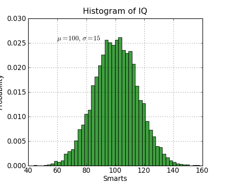
All of the text() commands return an
matplotlib.text.Text instance. Just as with with lines
above, you can customize the properties by passing keyword arguments
into the text functions or using setp():
t = plt.xlabel('my data', fontsize=14, color='red')
These properties are covered in more detail in text-properties <http://matplotlib.org/users/text_props.html#text-properties>.
Using mathematical expressions in text
matplotlib accepts TeX equation expressions in any text expression.
For example to write the expression \sigma_i=15 in the title,
you can write a TeX expression surrounded by dollar signs:
plt.title(r'$\sigma_i=15$')
The r preceeding the title string is important – it signifies
that the string is a raw string and not to treate backslashes and
python escapes. matplotlib has a built-in TeX expression parser and
layout engine, and ships its own math fonts – for details see
mathtext-tutorial.
Thus you can use mathematical text across platforms
without requiring a TeX installation. For those who have LaTeX and
dvipng installed, you can also use LaTeX to format your text and
incorporate the output directly into your display figures or saved
postscript – see usetex-tutorial.
Annotating text
The uses of the basic text() command above
place text at an arbitrary position on the Axes. A common use case of
text is to annotate some feature of the plot, and the
annotate() method provides helper
functionality to make annotations easy. In an annotation, there are
two points to consider: the location being annotated represented by
the argument xy and the location of the text xytext. Both of
these arguments are (x,y) tuples.
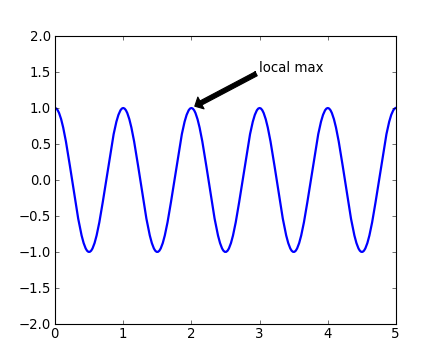
In this basic example, both the xy (arrow tip) and xytext
locations (text location) are in data coordinates.